
Rooder Story
In 2014, designer Li Qingjian set out to build a brand rooted in gratitude and a customer-first philosophy. The name ROODER holds special meaning—it was inspired by Li’s very first client, a tribute to the trust and partnership that laid the groundwork for his dream.
On July 17, 2014, Li began crafting a logo to capture the spirit of ROODER. After four rounds of refinement, the final design was completed on September 17, 2014, in Shenzhen, China. Every element was meticulously hand-drawn before being digitized, reflecting a balance of creativity and precision.
At the heart of the logo are the two "O"s in ROODER, reimagined as the front and rear wheels of an electric vehicle. The outer rings represent tires, while the inner circles feature nine uniquely arranged rectangular spokes—each distinct, symbolizing the diverse strengths and qualities of ROODER’s partners. Together, they form a unified wheel, much like how collaboration and mutual respect drive lasting success. The number nine, combined with the circular form, also signifies a journey: from nothing to something, from small to strong, and from local to global.
The remaining letters of ROODER were carefully styled to convey strength, modernity, and innovation. The result is a logo that not only reflects the company’s core business—electric vehicles—but also embodies its mission: to drive the future with integrity, collaboration, and an unwavering commitment to customer satisfaction.
ROODER is more than a brand. It is a promise to every client and partner: together, we move forward.
Shenzhen Rooder Technology Co Ltd
Rooder Technology Limited
Rooder US Electric Bikes & Scooters
-
Glidezone GD83 Dual Motor Electric Scooter 50 MPH 5600W for Sale
 Glidezone GD83 Dual Motor Electric Scooter 50 MPH 5600W for Sale
- Regular price
-
$1,199.00 - Regular price
-
$1,899.00 - Sale price
-
$1,199.00
Quick view
-
E-bike for Adults with Dual Battery 93 Miles Range 60V 3000W e20 Plus
 E-bike for Adults with Dual Battery 93 Miles Range 60V 3000W e20 Plus
- Regular price
-
$1,549.00 - Regular price
-
$1,999.00 - Sale price
-
$1,549.00
Quick view
-
Electric Dirt Bike BIBUFF GT600 72V 30AH 7500W Fast Speed 50MPH
 Electric Dirt Bike BIBUFF GT600 72V 30AH 7500W Fast Speed 50MPH
- Regular price
-
$2,399.00 - Regular price
-
$3,399.00 - Sale price
-
$2,399.00
Quick view
-
Fat Tire Electric Bike for Adults 28MPH 90 Mile Range for Sale
 Fat Tire Electric Bike for Adults 28MPH 90 Mile Range for Sale
- Regular price
-
$799.00 - Regular price
-
$951.00 - Sale price
-
$799.00
Quick view
-
Rooder JL86 10000W Electric Scooter for Adults with Dual Suspension
 Rooder JL86 10000W Electric Scooter for Adults with Dual Suspension
- Regular price
-
$1,899.00 - Regular price
-
$2,899.00 - Sale price
-
$1,899.00
Quick view
-
Rooder JL80 Dual Motor 6000W Electric Scooter 43MPH Smart APP for Sale
 Rooder JL80 Dual Motor 6000W Electric Scooter 43MPH Smart APP for Sale
- Regular price
-
$1,288.00 - Regular price
-
$1,799.00 - Sale price
-
$1,288.00
Quick view
-
Self Balancing Electric Scooter X60 Plus for Sale
 Self Balancing Electric Scooter X60 Plus for Sale
- Regular price
-
$1,599.00 - Regular price
-
$2,100.00 - Sale price
-
$1,599.00
Quick view
-
Electric Dirt Bike 60V 3000W 40 MPH 60-100 Miles Long Range
 Electric Dirt Bike 60V 3000W 40 MPH 60-100 Miles Long Range
- Regular price
-
$1,599.00 - Regular price
-
$1,999.00 - Sale price
-
$1,599.00
Quick view
-
Adult Electric Bike: 28MPH for Commuting & Mountain Trails for Sale
 Adult Electric Bike: 28MPH for Commuting & Mountain Trails for Sale
- Regular price
-
$998.00 $1,298.00 - Regular price
-
$1,299.00 - Sale price
-
$998.00 $1,298.00
Quick view
-
Off Road Electric Bike for Commuters: 48V, 28+ MPH, Long-Range Power
 Off Road Electric Bike for Commuters: 48V, 28+ MPH, Long-Range Power
- Regular price
-
$749.00 - Regular price
-
$1,299.00 - Sale price
-
$749.00
Quick view
-
24" Dual-Suspension Electric Bicycle: Conquer City & Trails
 24" Dual-Suspension Electric Bicycle: Conquer City & Trails
- Regular price
-
$439.00 - Regular price
-
$549.00 - Sale price
-
$439.00
Quick view
-
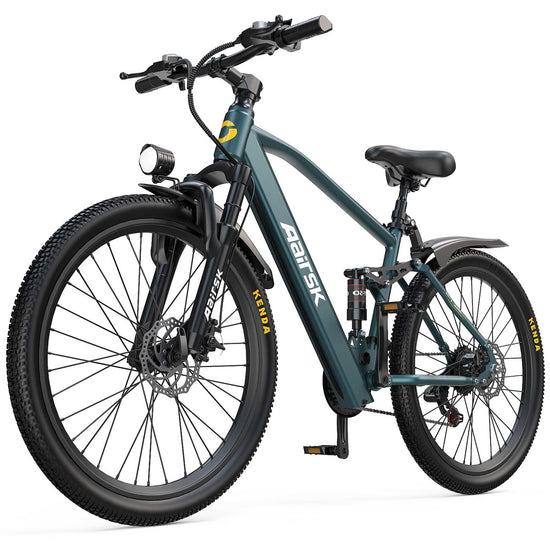
26" Electric Mountain Bike: 36V 10A, 22mph, 40-Mile Range for Adults
 26" Electric Mountain Bike: 36V 10A, 22mph, 40-Mile Range for Adults
- Regular price
-
$429.00 - Regular price
-
$539.00 - Sale price
-
$429.00
Quick view


Rooder EU Electric Bikes & Scooters
-
Electric Dirt Bike Off Road 45-65 KM/H 60V 30A 110KM Range for Sale
 Electric Dirt Bike Off Road 45-65 KM/H 60V 30A 110KM Range for Sale
- Regular price
-
$1,887.00 - Regular price
-
$2,666.00 - Sale price
-
$1,887.00
Quick view
-
Fat Tire Electric Bike Shengmilo S600 26" Dual Motor EU CE for Sale
 Fat Tire Electric Bike Shengmilo S600 26" Dual Motor EU CE for Sale
- Regular price
-
$1,443.00 - Regular price
-
$2,378.00 - Sale price
-
$1,443.00
Quick view
-
Fat Tire Electric Bike for Adults | 48V 15Ah | NFC Start | 25km/h CE
 Fat Tire Electric Bike for Adults | 48V 15Ah | NFC Start | 25km/h CE
- Regular price
-
$925.00 - Regular price
-
$1,250.00 - Sale price
-
$925.00
Quick view
-
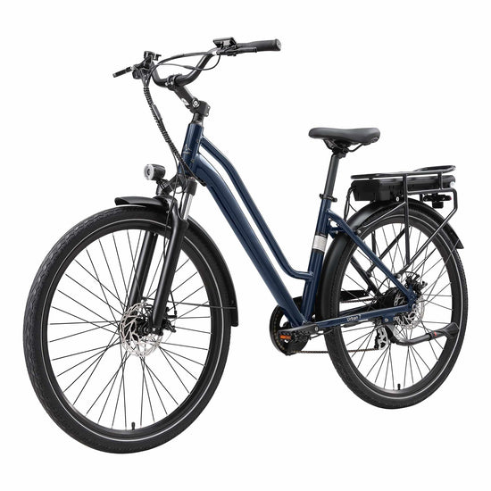
26" Adult Mountain E-Bike 468wh 250W 25km/h 40km Range for Sale
 26" Adult Mountain E-Bike 468wh 250W 25km/h 40km Range for Sale
- Regular price
-
$754.00 - Regular price
-
$942.00 - Sale price
-
$754.00
Quick view
-
26 Inch Electric Bike for Adults 250w Motor 25km/h 30-55km Range
 26 Inch Electric Bike for Adults 250w Motor 25km/h 30-55km Range
- Regular price
-
$643.00 - Regular price
-
$831.00 - Sale price
-
$643.00
Quick view
-
Rooder Maratho 28" Electric Bike Torque Sensor 250W 25KM/H for Sale
 Rooder Maratho 28" Electric Bike Torque Sensor 250W 25KM/H for Sale
- Regular price
-
$1,432.00 - Regular price
-
$2,045.00 - Sale price
-
$1,432.00
Quick view
-
Rooder MULE Folding Electric Bicycle 100-120km Range for Women
 Rooder MULE Folding Electric Bicycle 100-120km Range for Women
- Regular price
-
$1,165.00 - Regular price
-
$1,663.00 - Sale price
-
$1,165.00
Quick view
-
Rooder Urban 7 Electric Bike 36V 12.8AH 250W 25KM/H CE EU for Sale
 Rooder Urban 7 Electric Bike 36V 12.8AH 250W 25KM/H CE EU for Sale
- Regular price
-
$1,210.00 - Regular price
-
$1,728.00 - Sale price
-
$1,210.00
Quick view
-
Rooder Smart30 Electric Bike 36V 9.6Ah 250W 25KM/H 20inch Tires
 Rooder Smart30 Electric Bike 36V 9.6Ah 250W 25KM/H 20inch Tires
- Regular price
-
$1,464.00 - Regular price
-
$2,091.00 - Sale price
-
$1,464.00
Quick view
-
Rooder Smart20 Folding Electric Bike 36V 250W 25KM/H CE for Sale
 Rooder Smart20 Folding Electric Bike 36V 250W 25KM/H CE for Sale
- Regular price
-
$1,116.00 - Regular price
-
$1,595.00 - Sale price
-
$1,116.00
Quick view
-
26" Electric Mountain Bike 48V 250W 25KM/H Rooder MX1 CE for Sale
 26" Electric Mountain Bike 48V 250W 25KM/H Rooder MX1 CE for Sale
- Regular price
-
$1,288.00 - Regular price
-
$1,888.00 - Sale price
-
$1,288.00
Quick view
-
Rooder SU8 Fat Tire Electric Bike 1500W 52V 20Ah 25KM/H CE for Sale
 Rooder SU8 Fat Tire Electric Bike 1500W 52V 20Ah 25KM/H CE for Sale
- Regular price
-
$1,199.00 - Regular price
-
$1,712.00 - Sale price
-
$1,199.00
Quick view


Rooder UK Electric Bikes & Scooters
-
Electric Bike for Women 15.5mph 36v 13ah 60km Range for Sale
 Electric Bike for Women 15.5mph 36v 13ah 60km Range for Sale
- Regular price
-
$581.00 - Regular price
-
$968.00 - Sale price
-
$581.00
Quick view
-
Off Road Electric Bike 60V 30AH 60-100 Miles Range for Sale
 Off Road Electric Bike 60V 30AH 60-100 Miles Range for Sale
- Regular price
-
$1,998.00 - Regular price
-
$2,498.00 - Sale price
-
$1,998.00
Quick view
-
Electric Mountain Bike 26" for Commuters & Weekend Trail Riders for Sale
 Electric Mountain Bike 26" for Commuters & Weekend Trail Riders for Sale
- Regular price
-
$556.00 - Regular price
-
$928.00 - Sale price
-
$556.00
Quick view
-
Electric Bike for Commuters: 15.5 MPH 70km+ Range for Sale
 Electric Bike for Commuters: 15.5 MPH 70km+ Range for Sale
- Regular price
-
$1,198.00 - Regular price
-
$1,712.00 - Sale price
-
$1,198.00
Quick view


Rooder Canada Electric Bikes & Scooters
-
Electric Bike for Adults Canada 28MPH 90-Mile Range for Sale
 Electric Bike for Adults Canada 28MPH 90-Mile Range for Sale
- Regular price
-
$872.00 - Regular price
-
$1,103.00 - Sale price
-
$872.00
Quick view
-
High-Performance Electric Bike 48V 18.2Ah 28+ MPH Fat Tire for Adults
 High-Performance Electric Bike 48V 18.2Ah 28+ MPH Fat Tire for Adults
- Regular price
-
$925.00 - Regular price
-
$1,541.00 - Sale price
-
$925.00
Quick view
-
48V Foldable Electric Bike for Adults | 25MPH | 20" x 3.0" Fat Tire
 48V Foldable Electric Bike for Adults | 25MPH | 20" x 3.0" Fat Tire
- Regular price
-
$555.00 - Regular price
-
$792.00 - Sale price
-
$555.00
Quick view
-
City Commuter E-Bike: 22MPH with Front Suspension 36V 250W for Sale
 City Commuter E-Bike: 22MPH with Front Suspension 36V 250W for Sale
- Regular price
-
$499.00 - Regular price
-
$712.00 - Sale price
-
$499.00
Quick view
-
Electric Mountain Bike 468Wh Battery 22 MPH & 40 Mile Range for Sale
 Electric Mountain Bike 468Wh Battery 22 MPH & 40 Mile Range for Sale
- Regular price
-
$530.00 - Regular price
-
$757.00 - Sale price
-
$530.00
Quick view


Rooder Swiss Electric Bikes & Scooters
-
Mangosteen FT03 Electric Bicycle 250w 25km/h Switzerland for Sale
 Mangosteen FT03 Electric Bicycle 250w 25km/h Switzerland for Sale
- Regular price
-
$2,600.00 - Regular price
-
$3,715.00 - Sale price
-
$2,600.00
Quick view
-
Mini eChopper Bike Mangosteen FT02 250w 25km/h Switzerland for Sae
 Mini eChopper Bike Mangosteen FT02 250w 25km/h Switzerland for Sae
- Regular price
-
$2,600.00 - Regular price
-
$3,715.00 - Sale price
-
$2,600.00
Quick view
-
Mangosteen FT02 EEC Chopper E-Bike 48v 22.5ah Switzerland for Sale
 Mangosteen FT02 EEC Chopper E-Bike 48v 22.5ah Switzerland for Sale
- Regular price
-
$2,857.00 - Regular price
-
$4,081.00 - Sale price
-
$2,857.00
Quick view
-
Mangosteen M1PS Citycoco Chopper Electric Scooter 72v 500w Switzerland
 Mangosteen M1PS Citycoco Chopper Electric Scooter 72v 500w Switzerland
- Regular price
-
$4,540.00 - Regular price
-
$5,675.00 - Sale price
-
$4,540.00
Quick view


